
 css
css
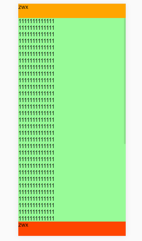
# 1.H5布局
上下固定,中间滚动布局(height 最好设置100%, 100vh在有的手机浏览器会不算底部的工具栏,所以会出现滚动条
1
<template>
  <div id="app">
    <header>zwx</header>
    <main>
      <ul>
        <li v-for="(item,i) in 50" :key="i">1111111111111</li>
      </ul>
    </main>
    <footer>zwx</footer>
  </div>
</template>

<style>
* {
  padding:0;
  margin:0;
}
html,body {
  height:100%;
}
#app {
  background:crimson;
  height:100%;
  display: flex;
  flex-direction: column;
}
header {
  height:50px;
  background: orange;
}
main {
  flex:1;
  background: palegreen;
  overflow: auto;
}
footer {
  height: 50px;
  background: orangered;
}
</style>
1
2
3
4
5
6
7
8
9
10
11
12
13
14
15
16
17
18
19
20
21
22
23
24
25
26
27
28
29
30
31
32
33
34
35
36
37
38
39
40
41
2
3
4
5
6
7
8
9
10
11
12
13
14
15
16
17
18
19
20
21
22
23
24
25
26
27
28
29
30
31
32
33
34
35
36
37
38
39
40
41
# 2.苹果手机底部安全距离
/** 前提要在 meta里设置:viewport-fit=cover */
padding-bottom:calc(1.33vw + env(safe-area-inset-bottom));
1
2
2
# 3.div中的img和div顶部有一小段距离的处理方法
原因:图片文字等inline元素默许是和父级元素的baseline对齐的,而baseline又和父级底边有必定间隔(这个间隔和 font-size,font-family 相关),所以设置 vertical-align:top/bottom/text-top/text-bottom 都能够防止这种状况呈现。而且不光li,其他的block元素中包括img也会有这个景象。
/** 方法一:定义图片img标签vertical-align:bottom,vertical-align:middle,vertical-align:top. */
img{vertical-align:bottom;}
1
2
2
/** 方法二:定义容器里的字体大小为0。 */
div {
    width:50px;
    border:1px solid #aaa;
    font-size:0;
}
1
2
3
4
5
6
2
3
4
5
6
# 4.textarea在ios上有内边距
// 设置disable-default-padding="true"
<textarea :disable-default-padding="true" :placeholder="textPle" v-model="teamState" placeholder-class="pet-font14-bbb3"></textarea>
1
2
2
上次更新: 5/13/2023, 5:48:10 PM